
The first European retrospective of Edward Steichen has been presented during the last months of 2007 at the Jeu de Paume in Paris. It was an exhibition I had to visit because, even if I knew the most famous images of Steichen, I barely saw his original works of his first pictorialist years. Moreover, the 450 photos that were part of the exhibition were a sure promise to deepen the knowledge of one of the most prolific and incisive photographer of the last century.
The exhibition starts, as expected, with the first pictorialist pictures of the beginning of the long Steichen career. I deeply looked all the pictures from the technique side, as I am an insider and a printer of antique techniques, even if I didn’t forget the aesthetic side.
The malediction of Ansel Adams

© Edward Steichen
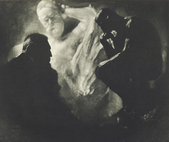
I was suddenly hit by the platinum prints of Steichen. They completely detach from contemporary platinum prints that are all characterized by deep blacks, tonal range as long as a piano keyboard, bright and soft whites, elevated contrast and legibility of shadows, where the separation of tones is always excellent. I do know for my personal experience that it’s not easy to completely brighten high lights, where often a little veil or a warm tone remains, even if that doesn’t take away luminosity to whites. In spite of everything, contemporary platinum/palladium blacks are always the deepest.
The assumption that deepest blacks come from platinum prints is a boast of photographers that use this antique print procedure as one of the platinum most attractive characteristic. In the ambit of fine art digital print, the arrival of new ink generation for printer was nothing short of a news that surprised, as it allows higher dmax than the traditional platinum one. The fact is, platinum and palladium seem to rhyme with darkest shadows, where details remain decipherable, opaque and not lucid shadows, but with an absolutely elevated dmax.
© Edward Steichen
Steichen platinum prints, for example Pool, Milwaukee, all have diametrically opposed features. The darkest shadows of the image never get over a bright grey, without achieving a level that could be defined black. Whites are practically absent, therefore the tonal range is short, pictures are grey and the contrast is missing. Prints seem obtained by negatives developed for prints on fiber paper, highly underexposed on ultraviolet during the printing.
Obviously Steichen was a great printer and the print characteristics do not depend by errors but probably they are a precise aesthetic choice. Looking at all these prints has been an amazing experience and brought me to a series of reflection.
© Edward Steichen
First of all I must underline that having prints with deep blacks and bright whites is not a need a priori. I would willingly call this rule malediction ofAnsel Adams. Probably an unintentional malediction, as Ansel Adams repeatedly sustained the interpretative freedom of each photographer towards its own expressive research inside the dark room.
La previsualizzazione è più precisamente vista come un’attitudine nei confronti della fotografia, piuttosto che come un dogma. Si assume che il fotografo abbia una totale libertà di espressione, in nessun modo ristretta dalla mia idea, o da quella di chiunque l’altro, di cosa sia l’arte.
Ansel Adams

© Edward Steichen
Despite this clear position, there’s no doubt that the invention of the zonal system and the print habits of Ansel Adams extremely influenced generations of photographers. Ansel Adams states that this is his way to take pictures and he only wants to give his apprentices the technical knowledge to express their own sensibility, not orthodoxy on how to print. And yet his never-ending researches on how to obtain the deepest blacks, the clearest whites, the maximum details inside shadows and lights, produced and still produce multitudes of emulous. His personal aesthetic and expressive research has been translated into assumed doctrine as absolute truth.

© Edward Steichen
Evolved amateur photographers seem to be infected by the Ansel Adams malediction, in such a way that they loose sight of the image content as well, sacrificed for the extreme rendering of black and white. Ansel Adams malediction is one of that bewitching that created as much troubles as anything else in photography history, tying expressive creativity and freedom in a formal and standard research of the “best print”. Disciples of Ansel Adams school take pictures that are identical to each other; often they look equal also in the thematic more than the printing characteristics. Photographers of a higher level seem to better exorcise the malediction, at least talking about the excessive details at the end of the tonal range, or the renounce to one of the two extremes, in the lowkey and highkey images. But Steichen prints, where blacks and whites are contemporaneously missing, obtaining flat, gray and less contrasted images, are nowadays the most rare.

© Edward Steichen
Still the research of black and white shouldn’t be an assumption a priori. Photography rules have been invented only for a didactic purpose; it would be appropriate to remember that they should be interpreted as a vade-mecum of causes and effects. Composing the image with a centered subject gives the idea of immobility. Clean whites give the idea of purity. The contrast augments the image drama, pushing its limits means obtaining pure graphical effects. A portrait cut at the neck gives the idea of a decapitated head. And so on; but none of these “expedients” is “wrong”. The first Steichen’s pictures, delicate platinum prints that play on soft gray tones, subtle nuances, almost readable and velvety shadows, all have a particularly sweet and touching atmosphere.

© Edward Steichen
Not only Steichen made me think about black and white as pure and simple stylistic expressive choice, as actually all the characteristics of the photography, but also the characteristics of his platinum prints ridicules the never-ending technical research that aims to obtain a formal perfection on antique print techniques. The continuous research of deepest blacks, maximum details, absence of imperfections and stains is nonsense and a masochism act. The evolution of the photographic techniques always tries to simplify and improve the procedure to get technically perfect, clear, contrasted, prints with a huge tonal range. I think it’s kind of stupid to print with an antique technique, on a hand-made paper and spend months to try to ameliorate it to the point of creating the perfect print, as it would have been printed by a machine. If the expressive choice is the formal perfection in the pure sense of the term, well: let’s print digital! The choice of using antique print procedures is more coherent when the goal is achieve non-conventional images.
In the middle of the pictorialism of the turn of the century

© Edward Steichen
After platinum, the displaying Steichen, une épopée photographique head on with beautiful gum bichromate prints. Absolutely wonderful and perfect, probably the best I’ve ever seen in my entire life. Curiously, blacks are far deeper and prints much more contrasted in relation with platinum. The exact contrary of what is expected. Gum gives black shadows only when lots of prints are overlapped, while with platinum is extremely easy. Rationally, bichromate gum would be used for delicate images while platinum for contrasted images. But Steichen works exactly in the opposite way. This is a teaching for all those who think that each antique technique is destined to a unique type of photography, or even to a unique subject. Each technique can in fact be adapted for every personal exigencies.

© Edward Steichen
One of the bichromate gum I mostly adored is “Self portrait”. I noticed with pleasure that the print interventions weren’t limited to the developing phase. In this print there are several evident, direct and accurate interventions. Steichen actually applied light blows on the palette, the brush, the line on the background and the collar of the shirt, directly adding brush strokes of white color on the picture. They turned out to be some exceptional expressive and technical interventions. A humiliating defeat for those who go on a crusade against digital, sustaining that digital images are not Photography because interventions twist their nature turning pictures into non-photographical images. People should at list stop pretending not to know photography history. Interventions on images, sometime even more radical than the nowadays computer retouching, were born together with photography and were absolutely common at the beginning of last century. Digital didn’t do anything but giving some more tools to photographers.
© Edward Steichen
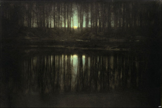
The overview on antique printing techniques ends with some large-sized carbon prints and some wonderful photogravures. These last are outstanding and I do understand why Steichen and Stieglitz considered them as real printings and not only simply photographical reproduction. Finally, having the possibility to see the real The Pond-Moonlight, that is at the moment the second most expensive picture ever, has been an emotional moment.
Talking about pictures, and not only about technique, almost all the images of the pictorialism are amazing. Some more “beginning of century” type, some despite pictorialism are extraordinarily modern.
© Edward Steichen
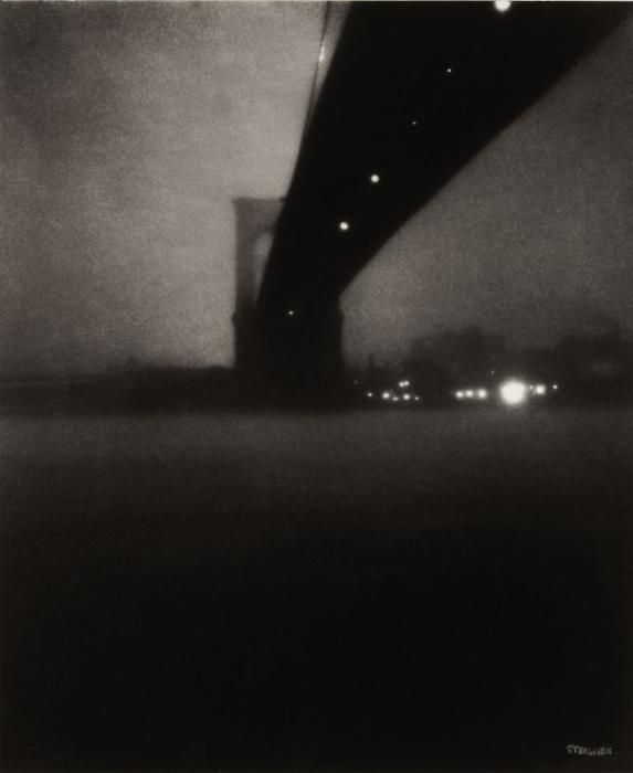
The one I like best of Steichen’s early years is Brooklin Bridge. Even if the print is soft and out-of-focus to follow the pure pictorialist style, the subject is already modern and the attitude is up-to-date even nowadays. Its dark and impending shape shot from below, its black bar that goes from the center to the right top, its empty mass of water at the base of the picture, its blinding lights that constellate the dark night. It’s an insolent composition, looking at it from the rules point of view, and a masterpiece on the aesthetic plan.
One of his first portraits I like the most is Gordon Craig, once again for its actuality and the astonishing composition of the image. The study for the cover of the 14th number of Camera Work has been a pleasant surprise. More than the image, I particularly adore the interaction of the subject with the golden frame, that remind me about the Vienna Secession.
The passage to modernism and commercial.

© Edward Steichen
The exhibition goes on with Steichen’s evolution to modernism. Even if I love pictorialism, I must say that the aesthetic innovation brought by Steichen in this second phase is a full-blown breath of fresh air. He discovers the focus; after all the flou of the previous images, pictures are now sharp and neat. Even if images are interesting and often modern, the birth of mode pictures, the most abstract still lives, arouse mostly an historical interest, considered the visual revolution that Steichen operated on his work. It was sometime even an anecdotal interest, as in the case of WWII aerial photos.

© Edward Steichen
Among the pictures of the modernist period I have to talk about a couple of images, which I’ve already known, as they’re my favorite Steichen’s: Maypole and George Washington Bridge. I had seen the first one not long time before at Paris Photo, one of the most expensive of the entire exhibition. Both are genial and actual, perfectly realized and pure direct photography. Those pictures are absolutely valid, for the image and that’s that, and not for all the modifications added after the shooting. Both are famous and used, together with some mode or pictorialist pictures, for the ads that cover Paris to promote the exhibition. I’m a little bit concerned that those kinds of pictures inside the exhibition can be counted on one hand. It is possible to see some floral still life, some shells, abstractions and all of the less-known shoots of the photographers. Anyway, I think that publicize an event with a picture unique between the 450 exposed is a sort of joke. And it’s quite a shame because I would have appreciate some more similar Steichen’s works, both on palaces and on bridges.

© Edward Steichen
At this point of the exhibition there’s a spiral staircase that leads you to the second half of the exposition. While climbing the stairs, delirious sounds of machines, engines and factories surround my ears, and I think that should mean a definitive passage to modern photography. I go up full of trepidation, convinced that photos of machineries, factories, trains, palaces are hidden over there, waiting for me. In point of fact, delusion is total. The second floor is practically plenty of mode pictures, portrait and ads.
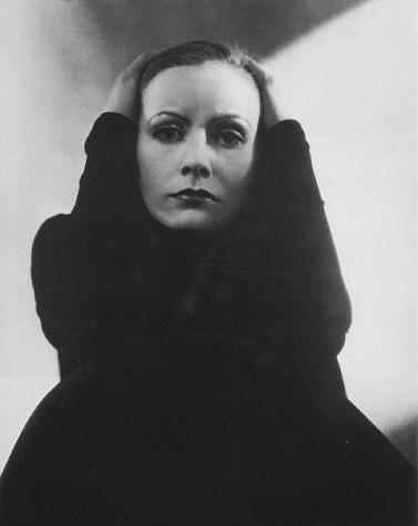
Obviously, they’re interesting and some of them stunning, but surely supernumerary. They’re fascinating, as they tell the story of an entire époque and its high society, but they’re seriously too much. The second part of the exhibition is practically dedicated to worldly images that finally are terribly annoy for they repetitiveness. The worst thing is that, compared to many other shoots, they’re insignificant works, probably commercial ones; they are interesting only because they represent a well-known character, a star of the past. These pictures, historically important, are put aside images of extraordinary strong expression and beauty, as Greta Garbo portrait, one of the most touching shot of the actress.
© Edward Steichen
For sure, worldly and commercial photography played a big role inside Steichen’s career. It is interesting seeing the ads he produced, but the number of fashion images and portraits is definitely disproportionate compared to the entire exhibition; a more severe selection would have been useful to the second part of the exposition, a little bit boring and repetitive. The problem was born by a contemporary confusion on what art is or generally on what merits to appear in museum. I don’t think Steichen thought about exposing in one of the most important Parisian museum when he took his aerial reconnaissance pictures from the military planes over Europe. Obviously in a retrospective some of those pictures are justified, to have a complete idea of all the areas the photographer touched. The same should be for mode and high society ones. It is known that Steichen had an intense activity of portraitures and fashion photographers for several years. It is also known he put seriousness and honesty in realizing commissioned works. Anyway this is not a good reason to build a retrospective where more than half of the presented works are dedicated to those themes.

© Edward Steichen
In any case, apart from that the exhibition has been an amazing opportunity to deepen Steichen’s work, one of the major figure of the ‘900 photography. It allowed the live study of some wonderful platinum prints, carbons, gum bichromates, unforgettable photogravures and even superb dye transfer. Prints that still have a lot to teach. Moreover, it has been the occasion to admire some of the most famous pictures of the history oh photography.


Rimango senza parole quando trovo un bugigattolo pieno zeppo d’informazioni interessanti.
Continua così, il mio tempo libero lo dedicherò volentieri alla lettura dei tuoi articoli.
Grazie Francesco, i complimenti fanno sempre piacere. Da parte mia continuerò a metterci tutto l’impegno necessario perché che Camera Obscura continui a essere interessante e soddisfare le aspettative dei lettori.
A presto
You can also subscribe to this post comments RSS feed.