The research of the perfect technique, from the deepest black, to the larger gamut, to the most defined detail, but even to the most expressive and original picture, turns sometime photography into a boring and repetitive job, converting the shooting into some more and more formal and disconnected tests that aim to the original objective of this occupation: creativity.
Sometime I feel like I need to go back to the ludic aspect of photography, that sensation that lets you freely create, the pleasure of entering a dark room to experiment and play. When the last months have been spent testing if that particular sizing for platinum better lighten the image, trying to complete that series of images for a certain portfolio or repeating again and again the calibration procedure on digital negatives… well, I swear that abandon for one day seriousness and discipline makes you feel the pure pleasure of photography.

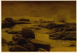
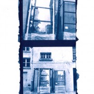
The other day I had the possibility to play a little with color prints. I took back from my closet an old RA-4 kit of the 90’s and a box of color paper that I bought some years ago, and used with scarce success. I then printed some black-and-white pictures, to obtain monochromatic pictures. The huge advantage in contrast to toning is that every color can be easily obtained. You do not only have the choice of the picture tint, but also you can choose every kind of saturation, from neutral images up to deepest colors that every kind of paper can give in return.
The first trouble is that color negatives have a mask absent on black-and-white negatives. Literature suggests interposing a non-exposed film color but developed in the optical path of the enlarger, or an 85B orange filter. As I didn’t have both of them, I thought I could print on a Agfa Copyjet film a square similar in color to the mask. Apart from the difficulty in determine the precise color, once positioned the handcrafted filter on the enlarger I had an unpleasant surprise. When interposed between negative and paper, the image is completely blurred, unless printing a big filter and positioning it in perfect contact with the paper. When the hand made filter is positioned between the light and the negative, the results are curious halos on the print. The material practically interacts in a too strong manner with the light and I had to renounce.
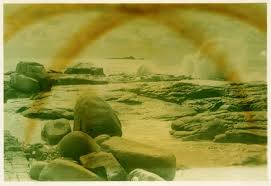
Cyan, magenta and yellow filters used without the mask to color the base e b&w film, have a reduced impact on the color of the print. Therefore I used contrast filters on an other enlarger head for black-and-white prints, which efficaciously color the light. This way it is harder to obtain the exact desired color, as it is easier to resonate using the Maxwell triangle: the three primary colors of additive synthesis (red, green and blue) at the top of the triangle and the three complementary colors of subtractive synthesis (cyan, magenta and yellow) on the borders of the triangle. So, if you want to obtain a redder print, you would just augment the filter of the opposite color, the cyan. In the same way, if you want a more yellow print, you would just diminish the yellow filter or contemporary augment cyan and magenta.
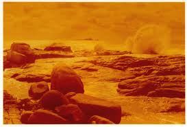
Using contrast filters instead of color filters, this simple procedure partially fails and the obtained colors are the one you must focus on. They give an interesting effect anyway.
I noticed that prints looses a lot of contrast compared to ones obtained on black-and-white paper, at least with the materials I used. Negatives with high-density range, adapted to Van Dyke Brown prints, can be correctly printed, while the ones for silver chloro-bromides print without blacks and without whites. At the same time, images are pleasant, most of all when dark printed, and this is my personal taste.
Obviously, Photoshop is one click far away from the work explained in those pages… but craftsmanship would be loss, and this was the principal intent of the article.


Salve sono un foto amatore che sviluppa in b/n,
Siccome il mio ingranditore può anche stampare a colori volendo (almeno ho i filtri),
volevo sapere come e dove posso trovare la carta e gli acidi per il colore.
Aspetto gentilmente una risposta,
Saluti Cordiali.
Federico
Ciao,
dove la puoi trovare? Da Profot, in rue Condorcet a Parigi… È difficile per me rispondere, se non mi dici dove abiti e quali sono le tue difficoltà in merito.
Io semplicemente compro la carta e la chimica colore nello stesso negozio in cui compro quella per il bianco e nero. Prova a chiedere al tuo rivenditore abituale, dovrebbe avere a disposizione anche i consumabili per il colore.
Altrimenti puoi rivolgerti a un qualsiasi sito che vende materiale fotografico per corrispondenza.
Tieni presente che le stampe colore però non si sviluppano semplicemente come il bianco e nero, devi controllare bene la temperatura (vasca termostato) e sviluppare con un tubo rotativo.
Su internet si trovano molti tuorial che spiegano i dettagli.
ciao ciao
f
Ciao Fabiano, sono di Perugia, ho anche io lo stesso problema, a perugia non si trovano negozi che hanno carta e chimici per il colore. Vorrei sapere il nome di un rivenditore per acquistare sia la carta colore per la stampa, sia i chimici per lo sviluppo della pellicola e della carta. Mi puoi aiutare per favore?
Grazie
Roberto
Ciao Roberto,
non ho esperienza di acquisti online di chimica e carta RA4, potendo comprare tutto comodamente nel negozio della mia città.
L’unica cosa quindi che potrei fare è cercare con Google al posto tuo un negozio online di materiale fotografico e verificare se vende la chimica che cerchi. Ma non me la sento di consigliarti un negozio che non conosco, se poi non lavorano bene sarei in un certo modo responsabile della tua cattiva esperienza. Per rassicurarti comunque in genere non si hanno grosse sorprese.
Oltre ai motori di ricerca un’altra possibilità è quella di chiedere nei forum. Visto che la maggior parte delle persone che frequenta quelli in italiano vive in Italia forse trovi qualcuno che ha avuto il tuo stesso problema. Dei tanti forum di fotografia in italiano io frequento fotoavventure, puoi provare a chiedere lì.
Buona fortuna
Fabiano
Ho letto i diversi articoli su stampa e negativi digitali. Complimenti! Poichè è trascorso un anno dalla loro pubblicazioni, mi potresti dire per favore quale stampante si può usare adesso con migliori risultati dato che la epson e altre marche ne hanno “sfornato” dei nuovi ? Gradirei una risposta via e-mail.
Ringrazio scusandomi per il disturbo porgo cordiali saluti e… buon lavoro
Sebatiano- Agrigento
ciao e grazie del commento.
qualunque stampante moderna permette di ottenere ottimi risultati. le nuove stampanti epson con i loro inchiostri k3 sono adattissime sia per la stampa normale che per i negativi digitali.
per la scelta del modello quello che conta è il formato di stampa.
ciao
fabiano
You can also subscribe to this post comments RSS feed.