
A couple of years ago I printed some VDB on pigmented prints. It is a color print, obtained overlapping a ferric salts black and white print on a cyan-magenta-yellow inkjet print.
I think that one of the first photographer who used this technique has been Dan Burkholder, whom website contains wonderful platinum tirages with delicate pencil color. Ron Reeder proposes wonderful and similar images on his website too, where a detailed manual explains how to obtain those kinds of prints. These two authors prints on platinum instead of silver, but the technique is exactly the same.
The result I obtained in 2005 was nice, but far from Burkholder and Reeder’s. Colors vaguely remembered old handmade postcards spread in the first half of the 20th century, but their problem was brilliant pinks and pale greens in highlights, surely too saturated and luminous for me.

The defect started during the process of negatives separation. Here’s a resume of the technique: RGB image is converted into CMYK; K channel is saved in a separated file and will be used to produce the negative for ferric salt print; CMY channels contains all the color information used for inkjet print, to whom will be added ferric salt print. The problem is that all inkjet prints need RGB input file; therefore we can do the conversion or let the printer do it for us. The point is that in any case the image will face a CMYK to RGB conversion, which means going from color space with strict gamut to a bigger one. The result is excessive color saturation, with unnatural and brilliant colors. You may notice how face and hand, from natural skin color, takes an unpleasant magenta pink dominant after the conversion.
The effect is peculiarly described in Ron Reeder manual, page four. He adds that the obtained brilliant colors compensate the loss of saturation and luminosity due to platinum image overlapping.
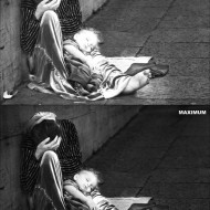
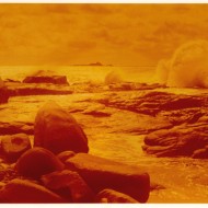
In my opinion, colors are too much brilliant, mostly in high lights. Shadows are acceptable, but, as you may notice in following image, the information contained in K channel is present in low tones only; high lights parts are completely white. This means that once VDB print is overlapped to pigmented print, high lights are exactly as they will come out from the printer, which means too saturated and unnatural colors.

I started thinking about solving the problem redistributing the value of the grey scale, applying a curve that completely cuts high lights, but the only thing I could obtain was dirtying the print and obtaining an unnatural contrasted curve. The image results was flat and dull.
Therefore I tried a gray scale conversion of the RGB image instead of K channel after the elimination of the color channels, to obtain the right negative for VDB print. As you may notice, now high lights contain information, which means that VDB print could dull the saturation even in high lights prints.
At first sight this could make the print too dark and flat, but at least the tonal range is complete, from shadows to high lights, and contains not only shadows, as when using K channel.
Inkjet print requires the normal procedure to obtain CMY channels, return to RGB and partial desaturation, applied mostly on skin, to keep brilliant colors low.
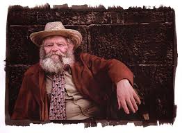
This is theory. It’s been some weeks that I had the files with color channels and the black and white image ready, but I kept on asking myself if this Reeder method variant could work or not. This morning I printed a wonderful VanDyke, with superb blacks and perfect contrast. Unfortunately it was only an old negative that I printed to verify that the new VDB solution correctly worked. Anyway, encouraged by this result and wishing to print new images, I went back to my Roscigno guardian separation files. I printed the digital negative using rough negative color and linearization curve, but I don’t want to re-calibrate the VDB print. I inkjet printed ihe photo on Arche Platine, Cot-320 and Lavis Vinci.
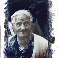
Here’s the first surprises, objectionable surprises. Even before using alternative techniques, I printed using Photoshop color management and the standard color profile of 2100; I didn’t expect any strong dominant. On the contrary, watercolor paper profile gives a horrid greenish dominant, matte paper profile a magenta one. In both cases, Cot-320 is the greenest paper, Lavis Vinci the most magenta.
I obtained the best result with a little hue correction applied by myself before printing, only on shadows, shifting color to magenta. I do not know if a personalized icc profile for any used paper would worth the while, because after the conversion from CMYK to RGB colors are already definitely modified. It is probably better to define a desaturation and correction of the dominants level that must be applied every time, accepting some variations. Background and clothing modifications are absolutely acceptable; the only problem remains the skin.
Talking about the Van Dyke Brown print, nothing to report, apart that the solution is hardly absorbed on the ink, as if it turned paper into a hydrophobic object. I solved this problem slightly augmenting the sensitizer quantity for surface unity and protracting for some seconds the coating. This way brush-strokes intersect and paper can humidify uniformly. A detailed image, such the one I worked on, doesn’t show any irregularity in coating, but it could be a problem for images that have large and regular areas.
First results are decidedly encouraging.
The result is an intense, large and sharp grain, probably due to the fact that draw paper are not suitable to inkjet printer, that it is a very pleasurable result. The print is actually darker than the original, as said before. This is in part due to the rough curve I used, in part because of the grey scale choice – instead of K channel. The image, as CMY channels have been partially desaturated, also has less brilliant colors, that are more pleasing once the print is done though.
VDB print adds rich shadows, which give an incredible three-dimensionality to the red jacket, which forcefully detaches from the background. The green dominant is unpleasant, the magenta one acceptable and a little desaturation of the face would make the image almost perfect. Arche Platine paper is the winner, both for inkjet print tonality and for the Van Dyke Brown refinement print. In particular, Lavis Vinci paper present unpleasant grey stains.
My conclusion is that the idea of realizing a grey scale conversion instead of K channel to obtain a digital negative for pigmented VDB prints is successful. The obtained image presents almost natural colors, united by a particular rendition, half middle fifties hand colored prints and half gum bichromate four-color processes.


You can also subscribe to this post comments RSS feed.